DMIT Capstone Brand Identity Guide
This project involved creating a logo and brand guide for the DMIT Capstone Group. Following this, the creation of a sixteen-page, saddle-stitched printed booklet outlining all brand guidelines in a detailed and comprehensive way.
Main Skills
Brand creation, print design, colour theory
Contents
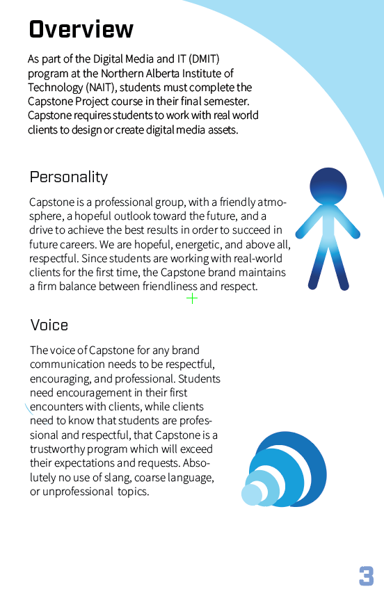
Overview
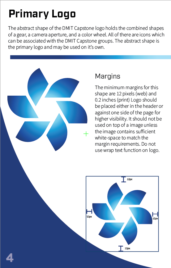
Primary Logo
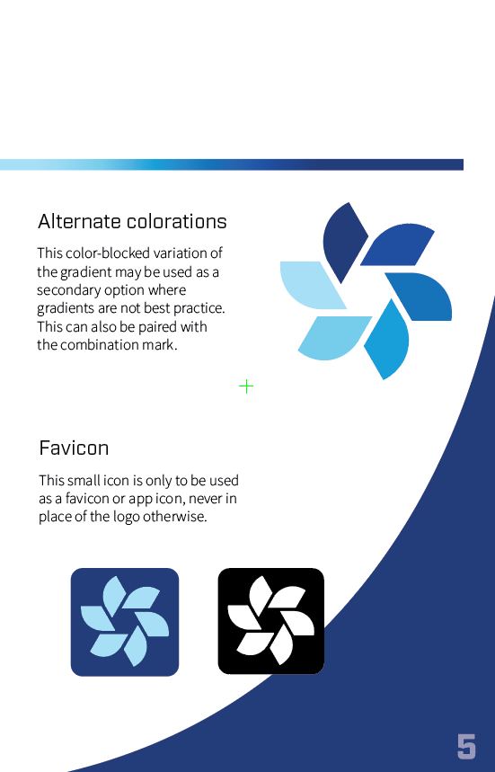
Primary Logo
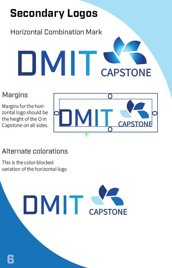
Secondary Logo
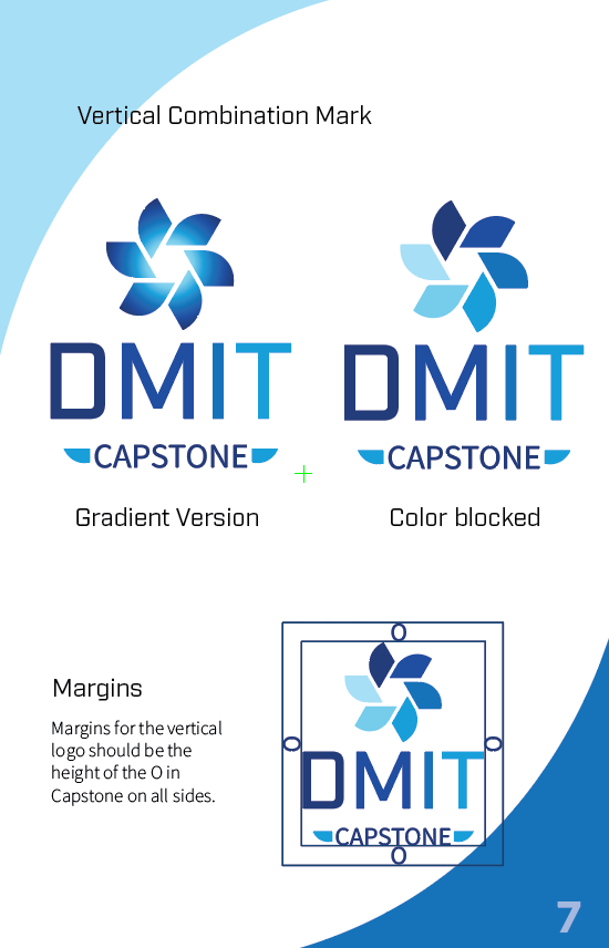
Secondary Logo
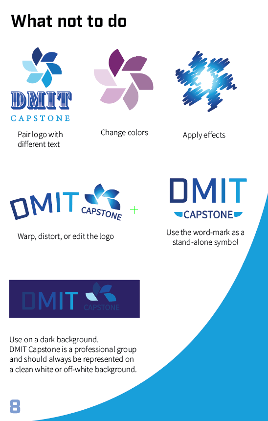
Logo Violations
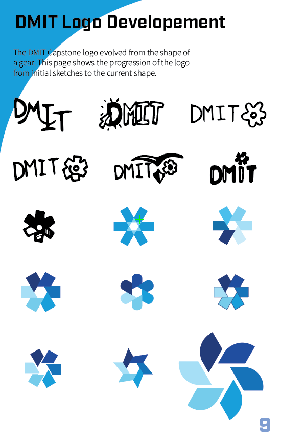
Logo Creation Process
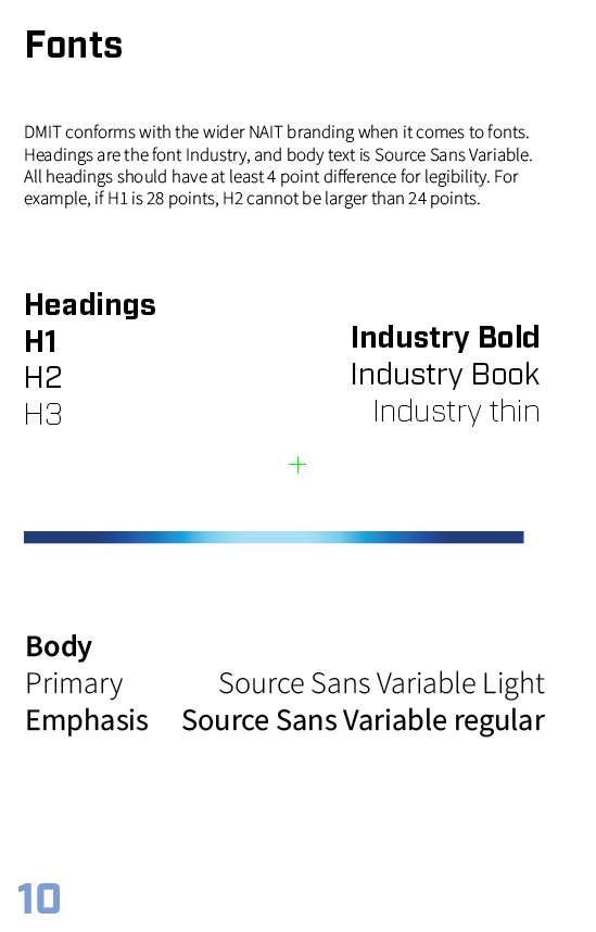
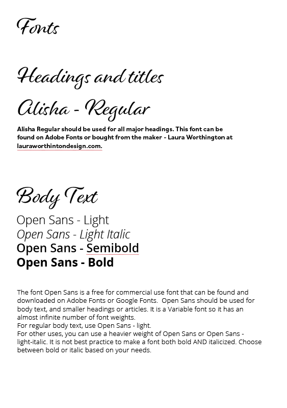
Fonts
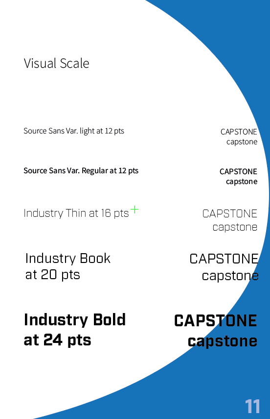
Visual Scale
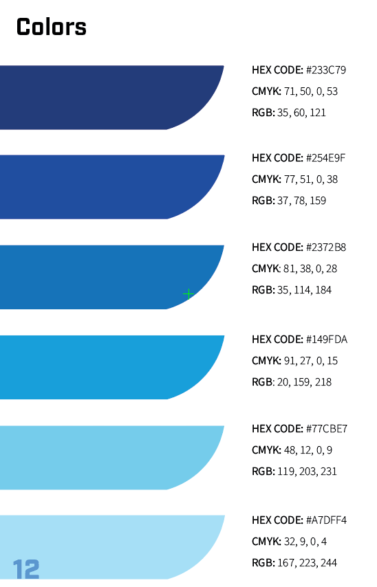
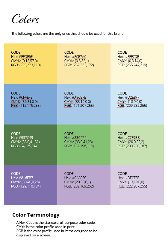
Colors
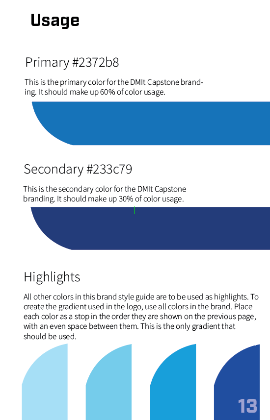
Color usage
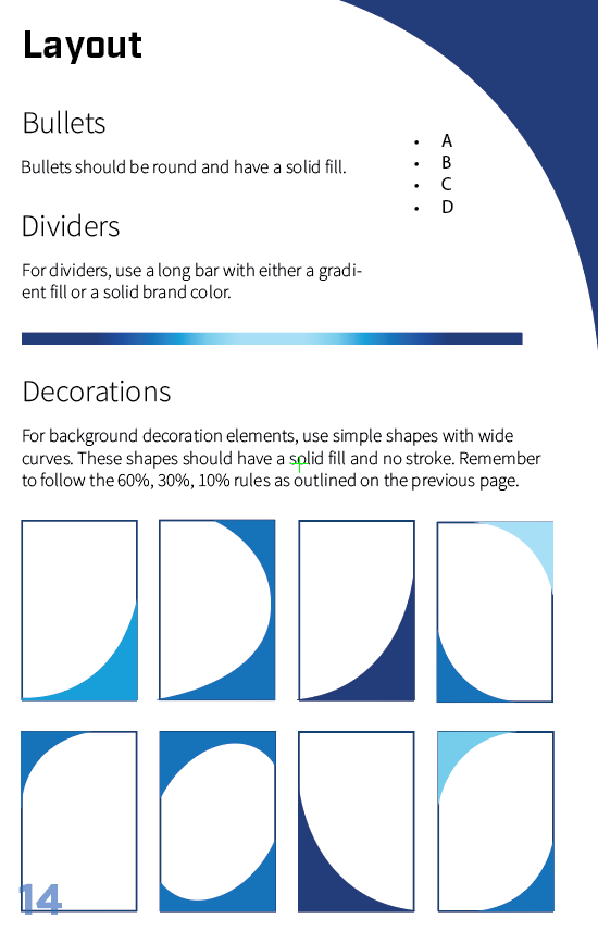
Layout
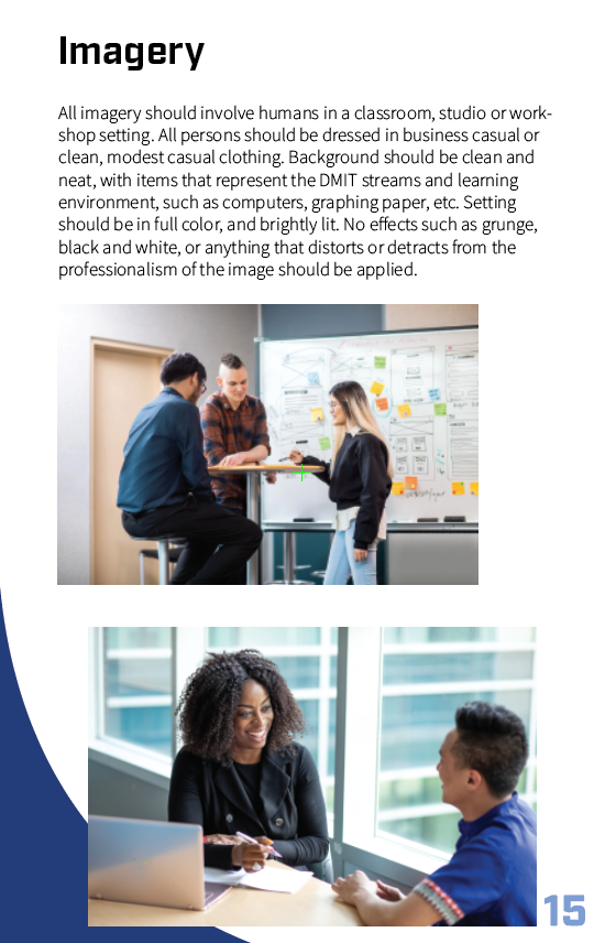
Imagery
Back Cover

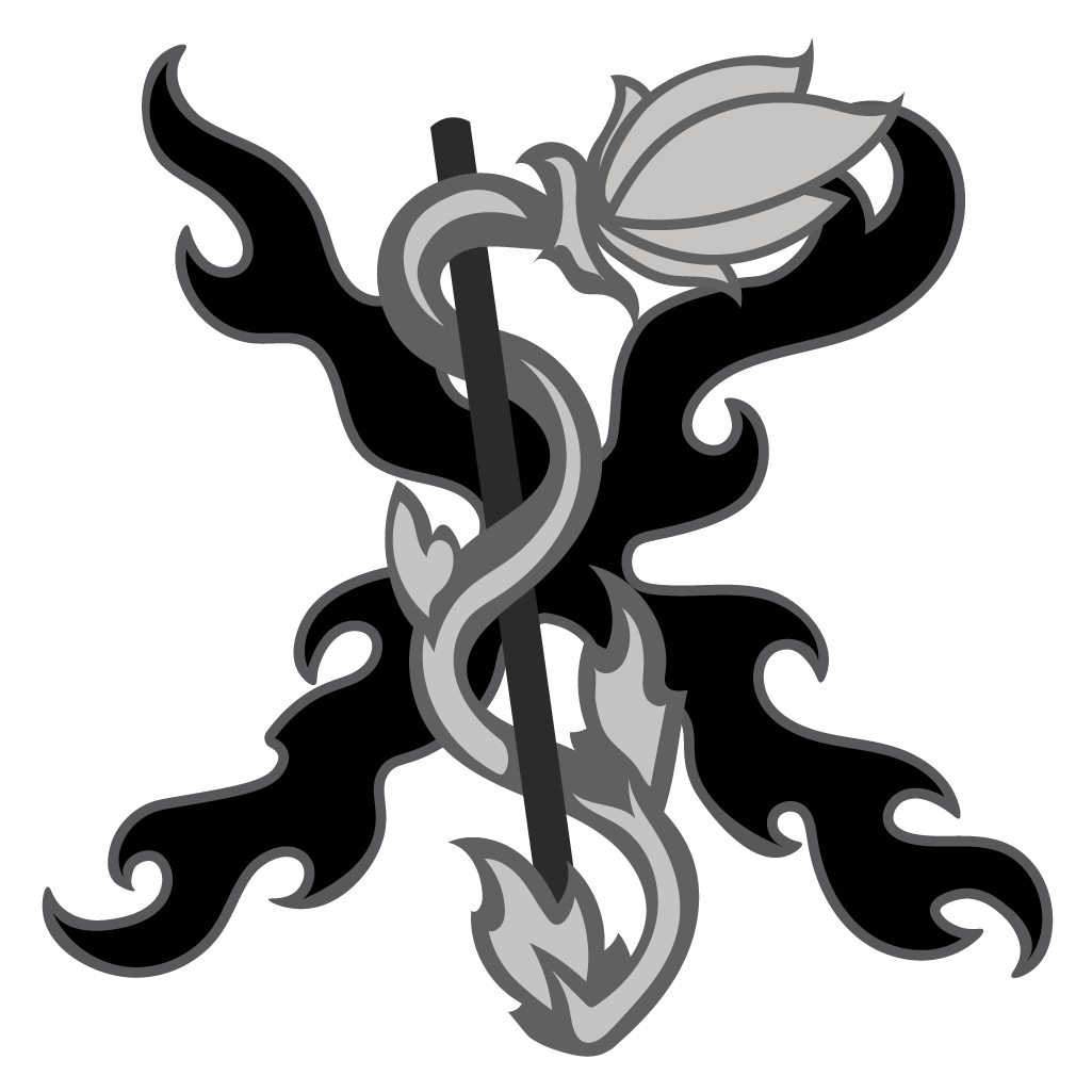
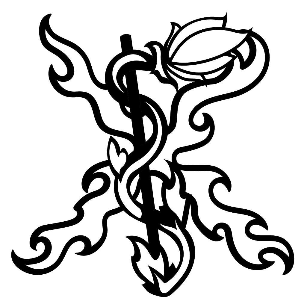
Fire Plant Games Logo
This project for Fire Plant Games studio involved creating a logo in multiple different formats for website, print, and social media use. The logo was designed after a Chi-Rho symbol, which looks like a P overlapping an X. However, the client wished for the symbol to be subtle, with a plant in place of a P, and an x made of fire.
Main Skills
Adobe Illustrator, Color Theory, Client Communication

favicon
greyscale version
black and white version

designed for dark backgrounds
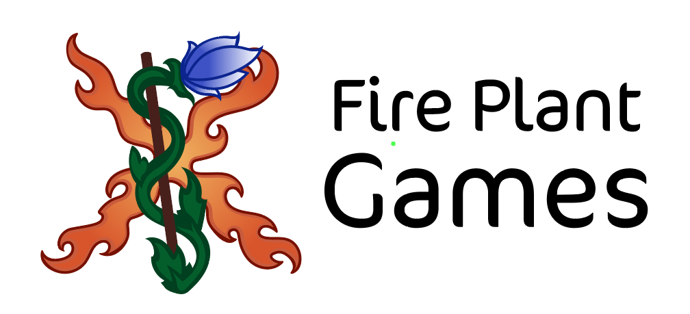
logo with text
Peaceful Strides Brand Creation
This project for Peaceful Strides Psychology involved creating a logo, color scheme, business card, and Looka website. The brand was designed to convey a calming, sophisticated feel, to capture the essence of nature walk therapy.
Main Skills
Adobe Illustrator, Color Theory, Looka, Photo sourcing, Web Design
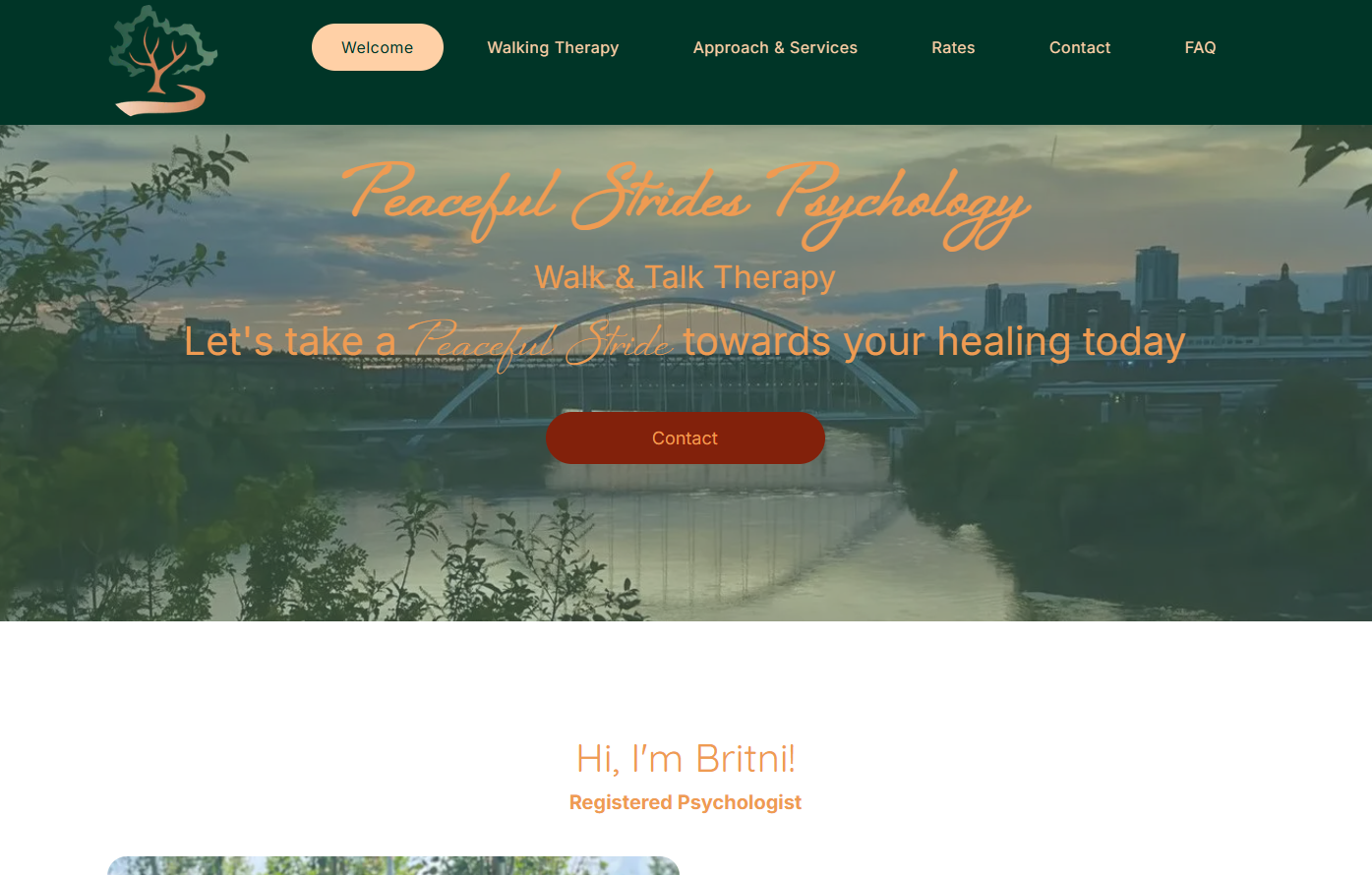
website opening page
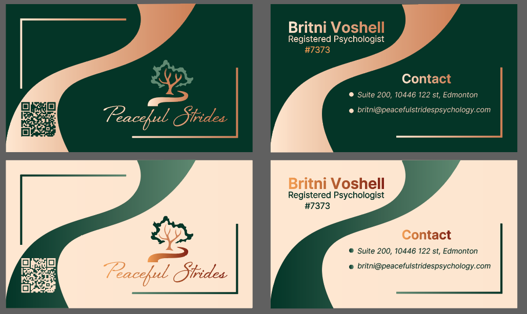
business card, light mode and dark mode
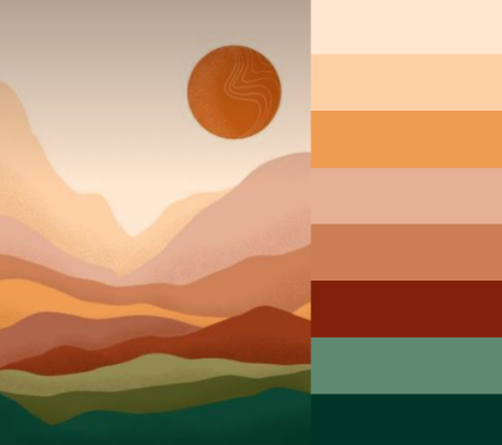
color scheme derived from photo

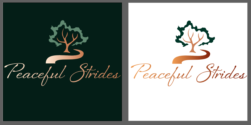
full logo, light and dark variation
shortened logo title, light and dark variation
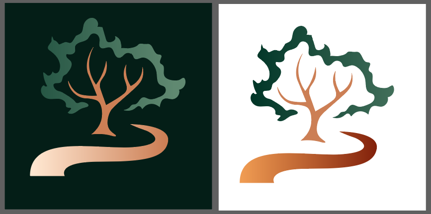
image-only logo, light and dark variation

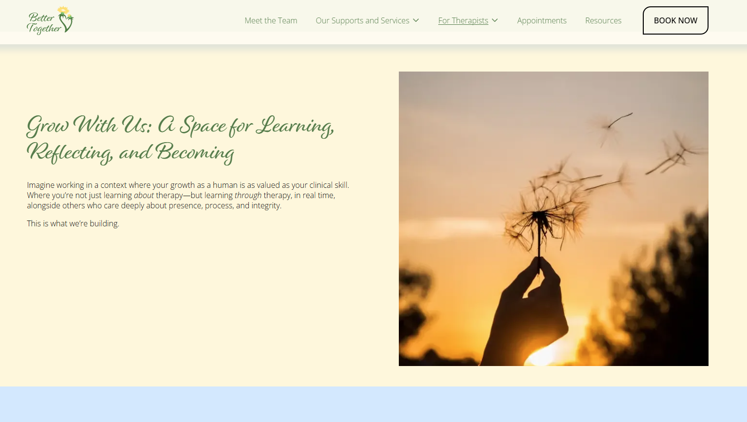
Better Together Psychology
This project for Better Together Psychology involved creating a logo, brand style guide, business card, and Squarespace website. Additionally, after the opening of their new office I created dandelion baseboard decals, an outdoor sign, and a large wall decal. The image of a dandelion represents resilience, the ability of humans to recover and grow after trauma. Two dandelions form a heart to represent relationships and connection. The colour palette is soft and calming. The completed website can be viewed at bettertogetherpsych.org
Main Skills
Adobe Illustrator, Color Theory, Squarespace
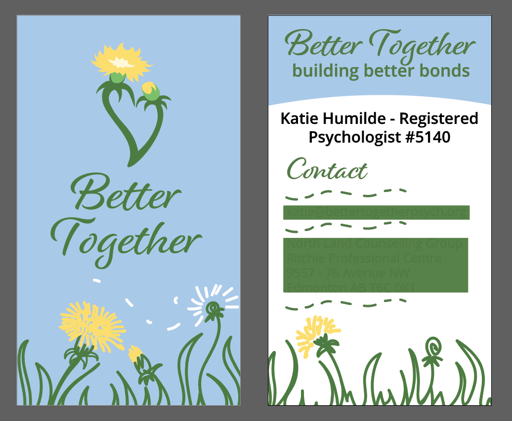
business card
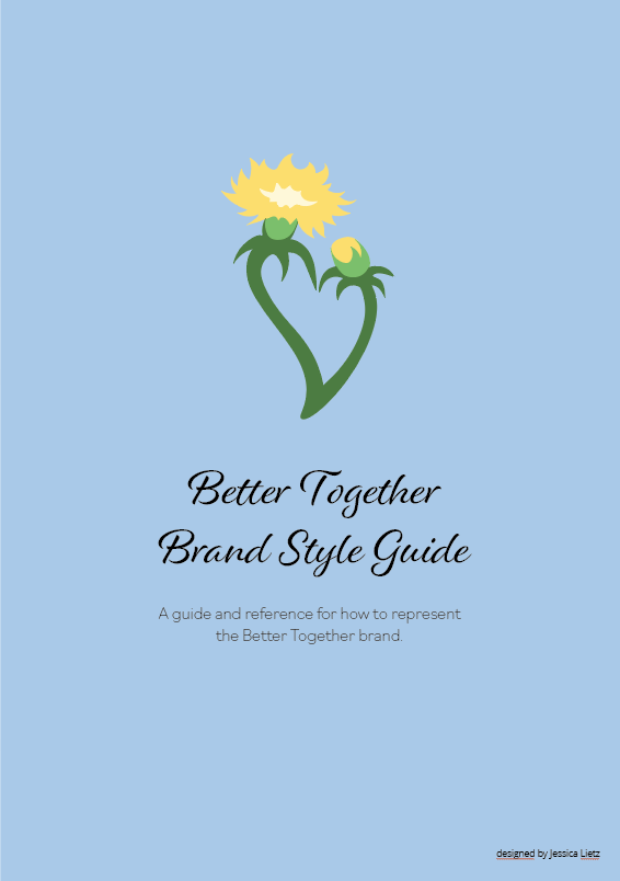
brand style guide
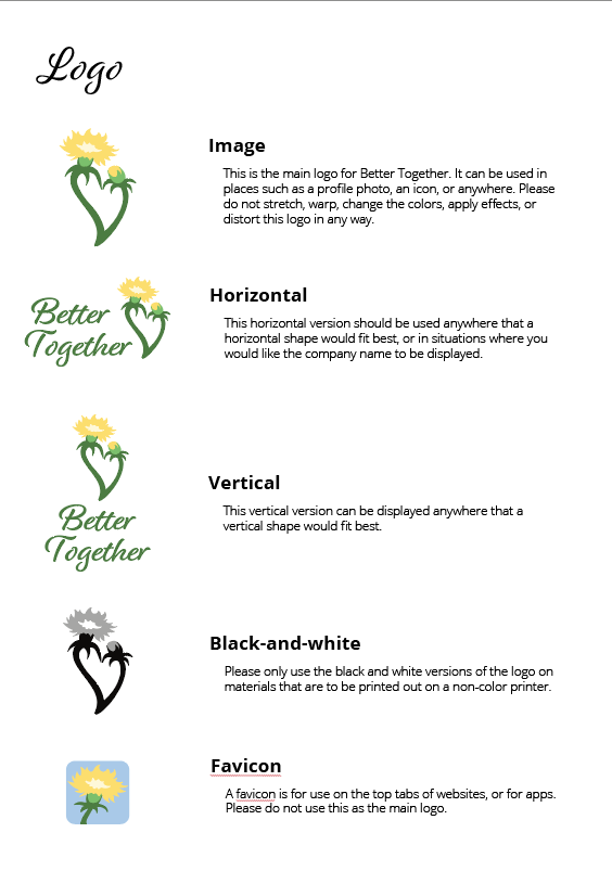
brand style guide
brand style guide
brand style guide
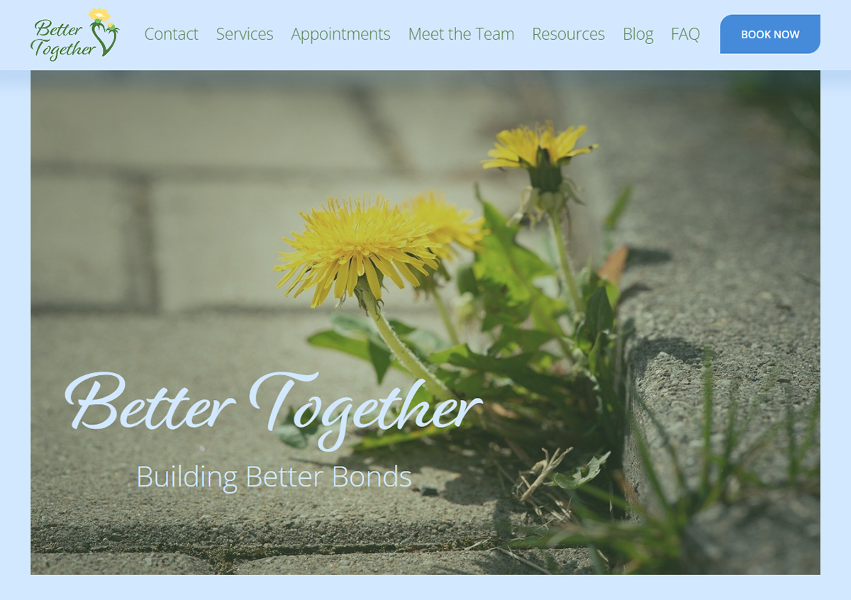
website home banner
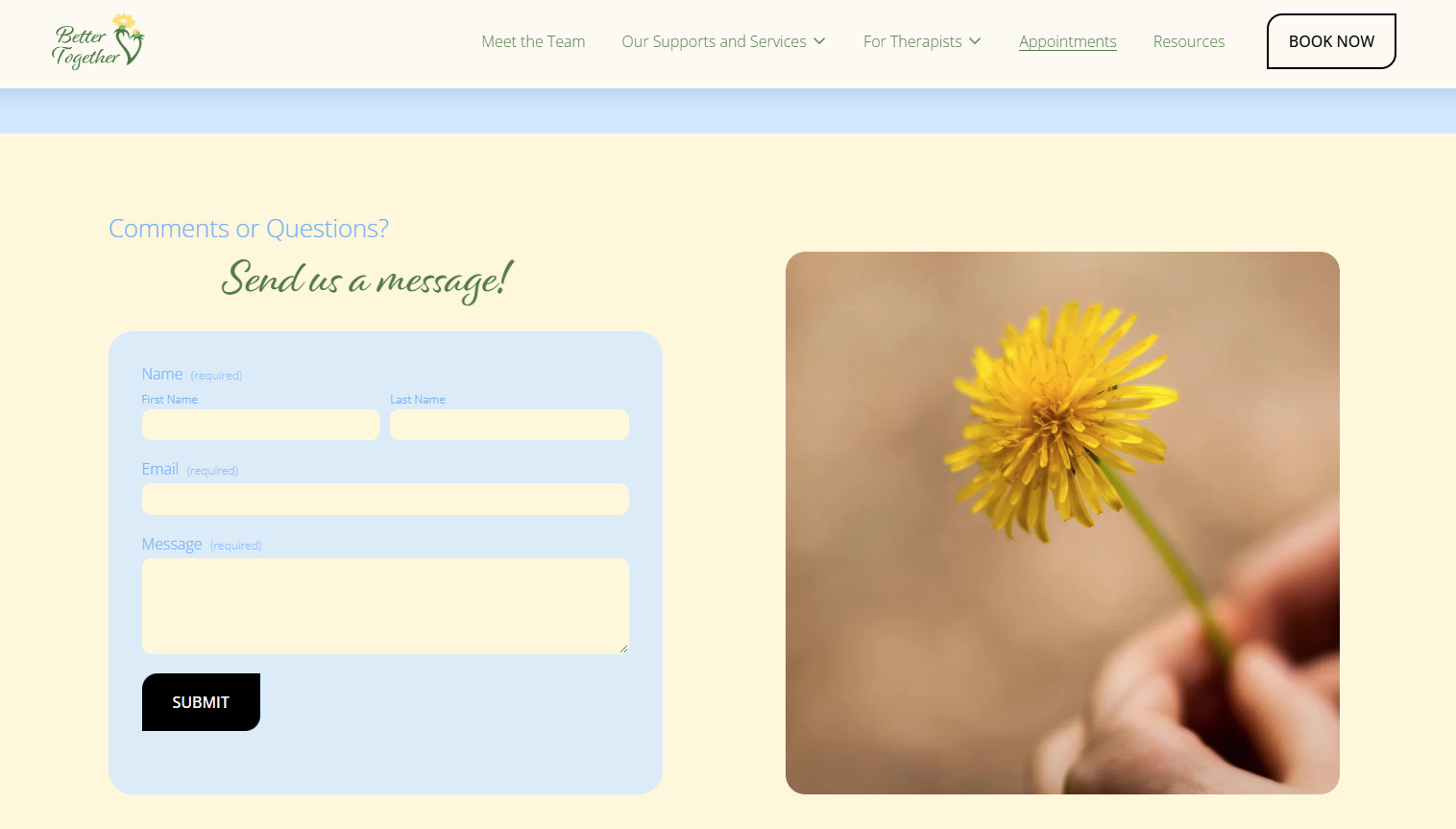
website example
website example
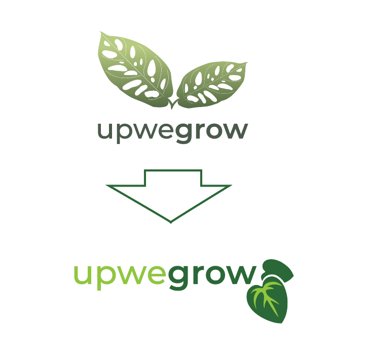
Upwegrow Brand Style Guide Project
This group project aimed to make Upwegrow Tropicals a more unified and modern brand. Featured are the sections that I contributed to this project.
Main Skills:
Company research, team leadership, logo design, colour theory
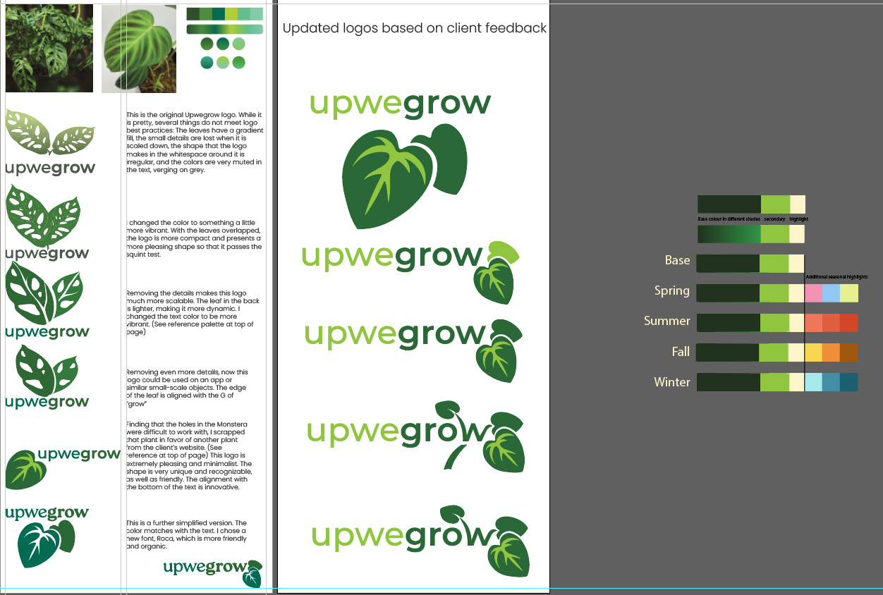
Logo design process and colour palette creation
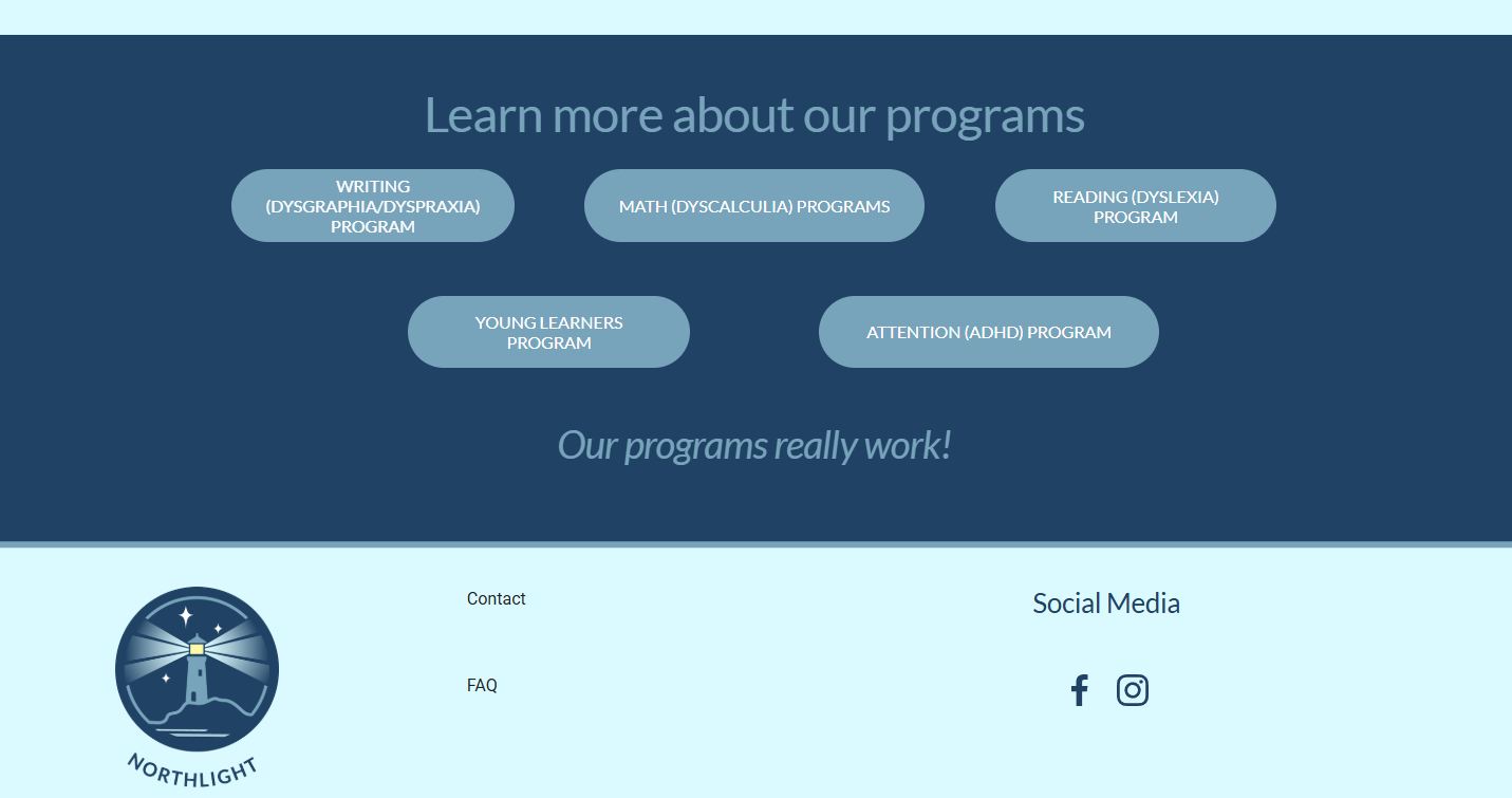
Northlight Learning
The project for Northlight Learning brought the business from the ground up, creating a logo, brand identity, business cards, and website for the clients. Focused on Neuro-divergent learning, all the designs are calming, dyslexia-friendly, and easy to navigate for picture-thinkers. The brand fuses a calm learning environment with the breezy west-coast feel that captures the personalities of the clients, based in the Vancouver area.
Main Skills
Adobe Illustrator, Color Theory, Squarespace, Client Communication
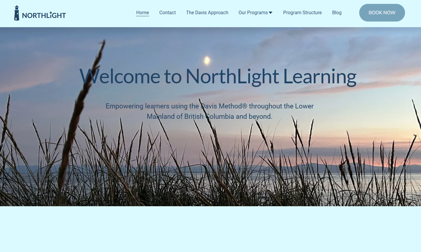
website home page banner

social media logo
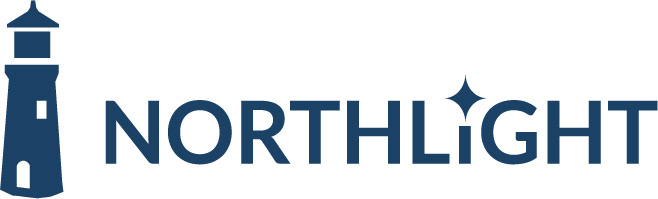
horizontal logo
horizontal logo - dark background
b&w print logo
website example
website example
Trusty Home Inspectors Brand Style Guide
This project involved creating the Trusty Home Inspectors style guide, business card, and logo. The start-up company required a modern and reliable brand, resulting in the creation of a sturdy oak supporting a house as their logo. Logo iterations are included below. Additionally, a website wireframe was created for Trusty Home Inspectors, which was created in Figma.
Main Skills:
Brand creation, working with clients, team leadership
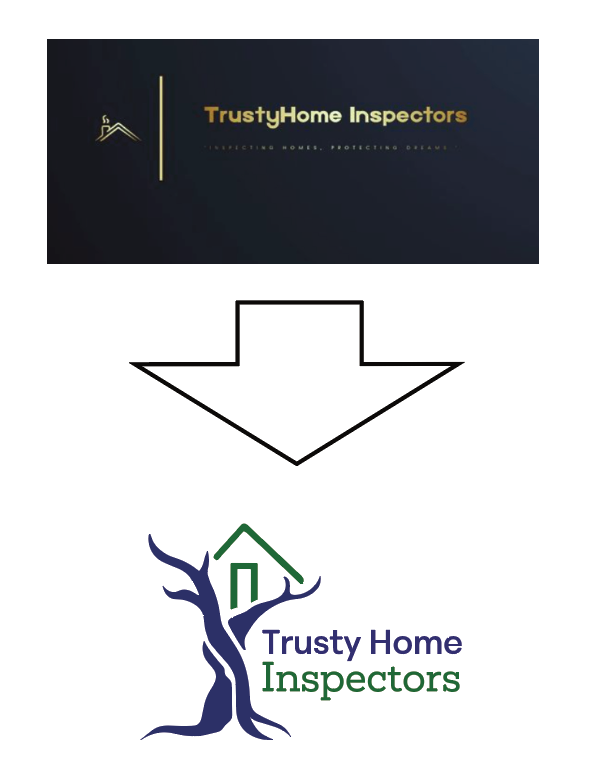
final logo
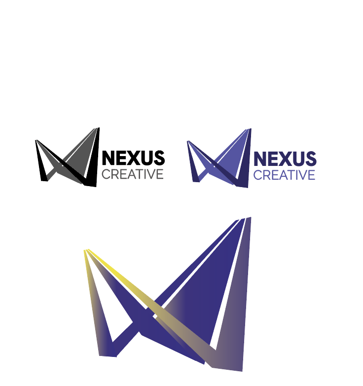
Nexus Creative Logo Design
This logo was designed for a group creative team which I lead for several client projects. The logo represents roads converging and the interconnection between people.
Main Skills:
Team leadership, logo iteration, Adobe Illustrator
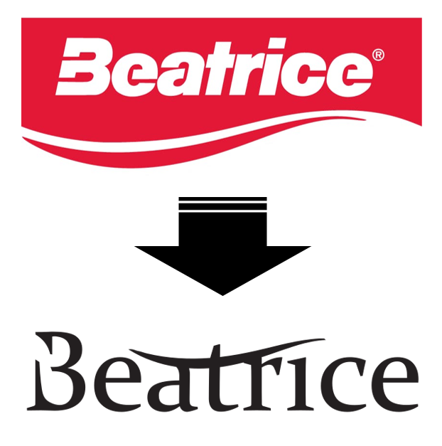
Beatrice Milk Logo Re-design
This project focused on transforming the milk company Beatrice into a skin-care company. The logo re-design is minimal and sleek. This design was for a project and not in collaboration with the actual company.
*this project was for academic purposes and not related to the existing business or any actual marketing campaigns.